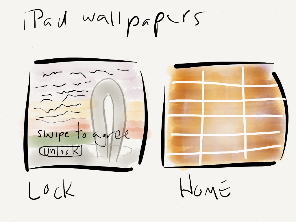
One of my small tasks related to managing our iPad program is to set up the devices, including such things as wallpapers and lock screens. When considering options I kept two main ideas in mind:
- The backgrounds must be simple enough not to be a distraction.
- The backgrounds must be iconic and specific to our university.
So, before the iPad meeting today I went out for a walk and took some pictures.
The plan was to get a nice shot of the monument on campus, and then perhaps a close-up of the iconic tile walls on campus. The use of each is planned out below.
I wanted the lock screen to be immediately identifiable on sight, while also serving another important purpose. I wanted to incorporate a “Swipe to agree” statement to remind users of our iPad usage policies. I am not sure about the legal strength of such usage, but I hope that it at least reminds students and teachers alike to treat the device with respect.
My second image choice was to use the iconic pinkish-purple tiles used on all the university building, based on the colors of the local sunsets, as the homescreen. I assumed this would be iconic and non-distracting, but my colleagues immediately responded with comments such as “it looks like the bathroom walls!”. Apparently, I failed to notice that some interior walls also shared the same tiles… As such, for now, we are going with the same image on both screens, but with the policy statement on the lock screen.
For reference, this is the homescreen we are using for now. I still want to find something simpler, yet iconic, to replace this, but I guess it is better than “bathroom tiles” for now.
What do you use for your schools iPad wallpapers?
 About
About
2 Comments